American Dream Index
The ADI captures the impact of globalization on the attainment of the American Dream at the local level.
The Lab’s first major initiative is to create an American Dream Index that ranks cities and counties based on their ability to leverage globalization to improve the lives of the median voter. This index focuses on four core components of the American Dream: access to housing, healthcare, income mobility, and jobs for both those with and without a college education. Through this process, we will be able to identify the local policies, politics, and practices that ensure the benefits of globalization are equitably distributed at the local level, so no one is left behind. With this information, policymakers will be motivated to improve their ranking on the index, which we will publish every three years to remain impactful and policy-relevant:
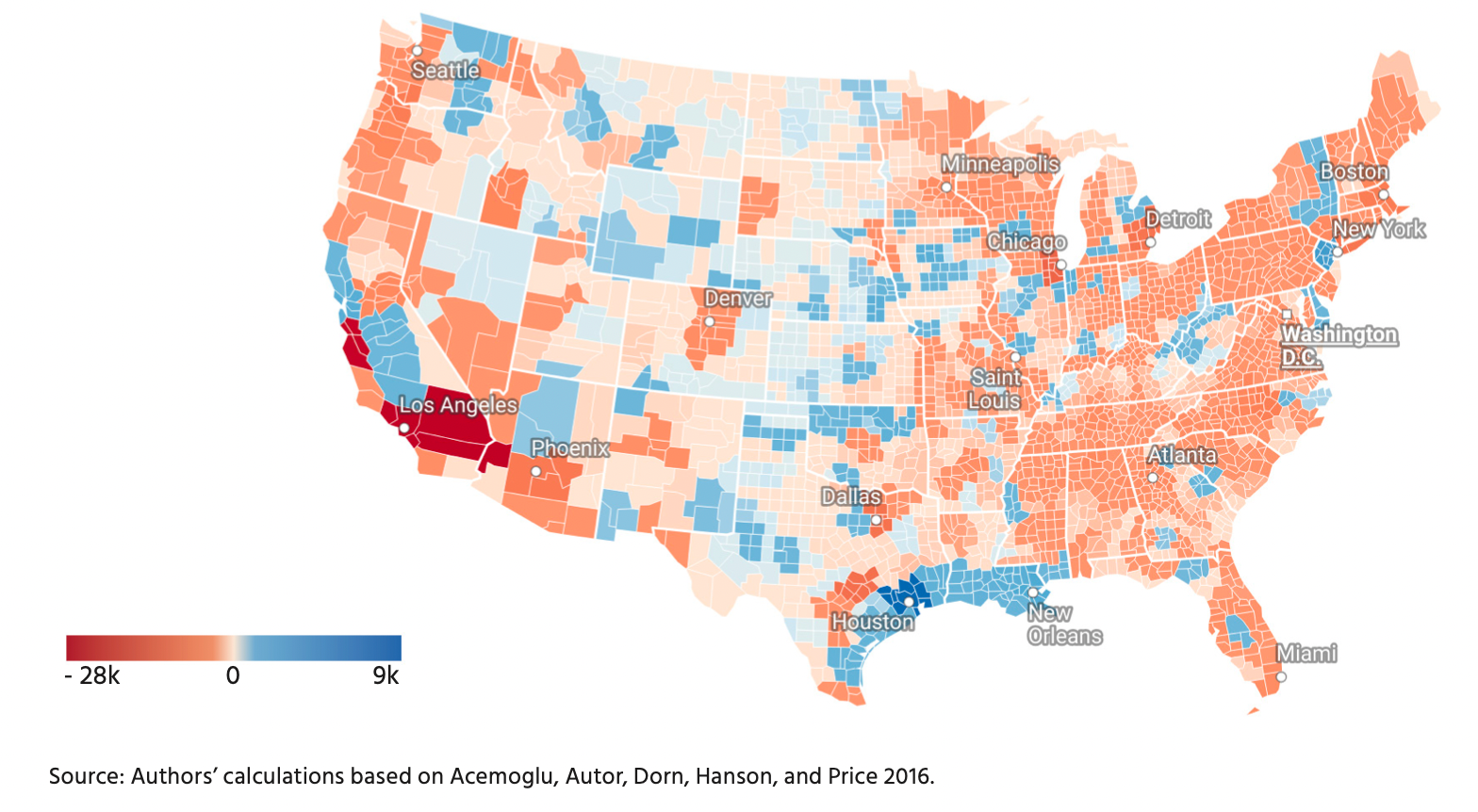
Predicted Manufacturing Employment Changes due to Imports by US Commuting Zone
Figure 1 – Changes in US manufacturing employment induced by imports from China and the rest of the world 1999-2011
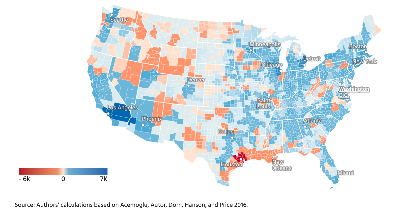
Figure 2 – Changes in US manufacturing employment induced by imports from the rest of the world ex-China 2011-2019
Learn more in our report, published with support from the Hinrich Foundation: Is trade really toxic? How imports support American jobs.