American Dream Index
Trade Exposure Maps

US Service Import Exposure: This map shows counties in which there were high (dark blue), middle (light blue), and low (grey) import levels of services in 2018.

US Manufacturing Import Exposure : This map shows counties in which there were high (dark blue), middle (light blue), and low (grey) import levels of manufactured goods in 2018.

Import Exposure and the American Dream: Import Exposure and the American Dream: this map combines import levels of services and manufactured goods (import exposure) from 2017, and overlays it on Gini index (American Dream). Low exposure areas are grey; areas with high exposure and low levels of change in Gini index are light blue; and areas with high exposure and high levels of change in Gini index are dark blue.
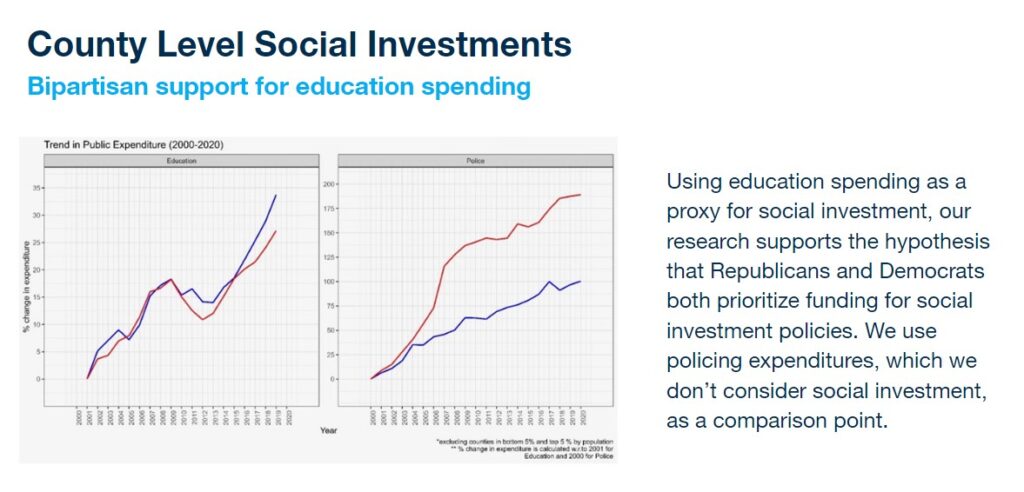
Social Investment Analysis